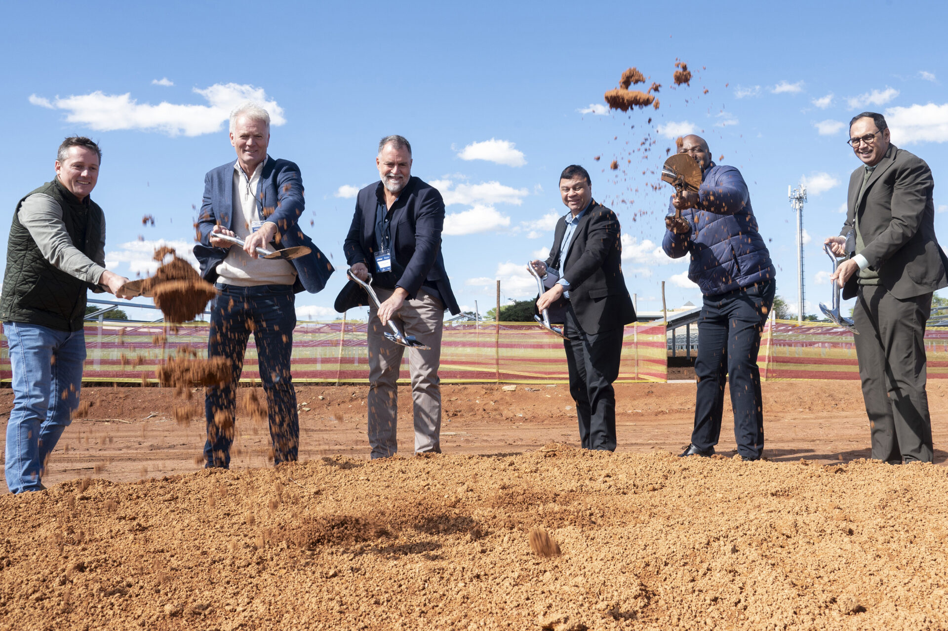
Atterbury first got to know the young artist Selwyn Steyn when he led the St Alban’s College installation for the first Cool Capital school arts installation project, which Atterbury Trust sponsored in 2014. Now a top architecture student in his second year at Tuks, Selwyn has just created bold eye-catching mural art for Die Klubhuis. We spoke to him to hear the full story of this full circle…
Were you always going to study architecture… you are so artistic? What made you decide on architecture and not art?
I was always torn between the two. Architecture won eventually, because I was always intrigued by spatiality, phenomenology and materiality, especially the application of these to arts. I also have a passion for the built environment and I get virtually the same fulfilment out of creative expression using space and structure as I do using paint or ink.
And how did it happen that you were commissioned by Atterbury to create the artwork for Die Klubhuis?
Louis van der Watt saw a mural I created at 012 Central in 2016, which was commissioned following a successful public work created as part of the school art project for the 2014 Cool Capital Biennale. The work at 012 is different in nature as it was carved from the plaster of the building, giving it an ephemeral and perhaps more informal quality.
What was the brief you were given? How much artistic licence did you have?
Louis gave me complete artistic licence to create anything which I felt was fitting for the space.
You get the commission and the brief… what happens next? Can you share some details of your inspiration and your design process, and then also your execution of the design? Did you work on your own, or did you have assistance in creating the final execution?
A work like this starts on a conceptual level. I try to be responsive to the site and also consider who’ll view the work, to create something that balances aesthetic appeal, contextual appropriateness and conceptual validity and relevance. I took some time to reflect on the notion of development and the inherently human quality of shaping our environment. In architecture, Nolli diagrams, named after the late Italian architect Giambattista Nolli, are used as a visual expression of which parts of a city are developed and which are not. These diagrams depict the often erratic and organic growth patterns of a city and are immediately reminiscent of other material phenomenon such as bacterial growth, fractals and so forth. Nolli diagrams have obvious visual appeal and offer an abstracted, yet empirical and reductionist view of a city. Most importantly they relate strongly to the idea of development, which is at the core of Atterbury as an organisation. Furthermore, despite searching numerous archives and sources, it became apparent that a Nolli diagram of Pretoria had never fully been done before, possibly because it is such labour-intensive task.
After settling on the idea, I created a map collating all the Atterbury developments, which required me to make a series of decisions relating to scale and orientation. The execution involved creating a stencil of the whole of Pretoria and thereafter inserting detail by hand. I was assisted by a trusted colleague in the arts, Henk Vryenhoek.
How big was the space for the artwork – did the size and placement of it influence your design in the end?
The artwork spans 7,3 meters by 2,4 meters. The large scale proved to be tricky in several senses. Artworks often function well on only a macro or a micro level, but with such a large wall, with human paths of circulation right next to it I had to ensure that the artwork functioned well both on the macro and micro levels. Furthermore, visual contextuality is essential to a successful end product and hence I had to create a work which was fitting to the corporate environment as well as being in touch with the character of the décor in the office. The proximity of David Krynauw sculptural works close to the wall acted as visual informant to the nature of the piece.
Considering the big size, did you create the work in one piece at the site, or how did installation work?
Although I used a stencil system as a means of technification and ensuring that scale and composition was executed properly, the majority of the work was hand-painted on site.
Were there any particular challenges that you needed to overcome?
What was challenging was the fact that for health and safety reasons I could only work during the evening. Light functions very differently on surfaces during the day and at night, so I would be uncertain what the developing artwork would look like during the brighter light of day. I had to rely on intuition to compensate!
What did you enjoy most about the process, and are you happy with the result?
I enjoyed many facets of this project; it gave me a deeper understanding of our city; but I always get great deal of satisfaction and enjoyment out of completing large-scale, time-consuming works. My hope is that I’ve created a work that functions well on an abstracted level, having aesthetic appeal if viewed as an abstracted, geometric arrangement of forms, while also being a conversation piece that invites interaction.
What was your client’s feedback about the end result?
Louis really likes the final product; it was awesome to work with him. I could see some of the Atterbury staff and clients that walked past were quite intrigued…
Do you think that more art commissions might flow from this one, and is that something you would like to pursue? Or will you be submitting your architecture portfolio to Atterbury for future development projects?
I’ve realised that Atterbury builds strong relationships with artists, as evidenced by the gigantic Angus Taylor sculptures at many of its developments. It would be great to grow with the company and have opportunities to work together in the future.